
Wednesday 28 October 2015
Friday 23 October 2015
Summary of Student Pitch Feedback
To summarise, my target audience said that they would prefer the title of my music magazine to either be EXPLORE, UNIVERSAL or INDIE CENTRAL. I have narrowed it down from those three and I have chosen EXPLORE as I think it best connotes my target audience.
Secondly, I will incorporated large images or more images than text to appeal to my target audience as pages filled with text would bore them.
Thirdly, my central image for my front cover will be taken in either, a studio, or with a white / plain backdrop. I feel as though this type of shot best reflects my chosen genre and the features within the magazine (e.g. the fashion and photography side).
Again - my target audience would prefer posed images taken in a studio or with a plain / negative background.
Finally, after my target audience not making a set decision on what format they'd like the Double Page Spread to be in, I have decided to produce an interview with the artist (one of my models) as I feel as though this format is clear and easy to read, and the questions that the interviewer asks will be in bold so that the reader can skim the question to see if it interests them (if it's worth reading!)
Thursday 22 October 2015
Student Pitch Questions and Feedback
QUESTIONS
1. Which title / name in the following list do you think represents an "indie" magazine well and why?
- aspire- explore
- aspire & explore
- universal
- happenings
- inspire
- music pulse
- indie central
- must
2. Would your ideal music magazine have more text than photos? If yes, why? If no, why not?
3. What would you like to feature as your central image and why?
4. In the featured images, would you prefer staged / "posed" photographs with a backdrop, or more natural photographs (playing at a concert for example)?
5. How would you prefer information displayed?
- in an article form?- in an interview form?
- in a questionnaire form?
I will obtain my feedback in a small focus group of 3-4 people who will form my target audience. This will then allow me to get a sense of what everyones individual thoughts are. I am then going to write my final thoughts.
FEEDBACK
1.
- aspire
- explore
- aspire & explore
- universal
- happenings
- inspire
- music pulse
- indie central
- must
Out of the list of nine possible titles for my magazine, three remain that my target audience likes / prefers. One person who liked the name "indie central" said that this connotes that the magazine will be purely based around all things indie and that more people would perhaps buy it as they would know this from the name. Another said that "explore" would be right for the masthead as many indie magazines are just one word and they feel as though this would connote the genre.
2. The majority of the people I asked said that they would prefer more text than images. The people who liked more text said that still like the text to be broken up into sections as large chunks of text can bore the reader and then they will just turn the page. People who preferred more images to text said that they like looking at the photos and that sometimes photos can say more than words.
3. A central image is the first thing a reader will see, in my opinion. It needs to be striking and positively eye-catching. My target audience said that they would love to see a posed image, maybe in a studio or with a plain background / backdrop, of the main attraction.
4. The majority (4 out of 5) said that posed images are better as it looks more organised and clean - this allows the reader to view it easily with out being confused that there are too many cluttered, busy images.
5. There was no set decision for this question. Two people said that they preferred an interview to display the information as this is exciting and allows the reader to really get to know the person or people being interviewed. But another one person made a very good point that a questionnaire can also help obtain knowledge about the person or people being interviewed.
Friday 16 October 2015
Wednesday 14 October 2015
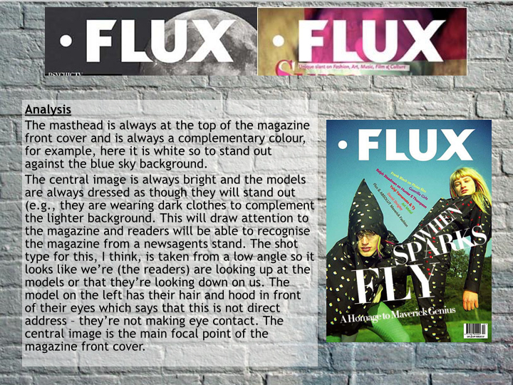
Analysis of 2 Double Page Spreads
DAZED MAGAZINE

DAZED has produced a double page spread which allows the ink of the photograph to bleed (printing) to the edge of the page. This makes the page look fuller and more exciting, encouraging readers to read the article / interview. The use of bleeding the photo is to stand out and grab the attention and eyes of the readers to make them read the feature.
The columns are long and take up the entire left page of the double page spread. In my opinion, I feel as though this wouldn't appeal to the audience as large chunks of text are displeasing to the audiences' eyes. The ratio of text to image is 50:50, as this magazine is appealing to a more mature audience, this ratio works well.
The photograph is staged (posed) and the background has a red hue - this connotes passion and links to a section in the text; the interview mentioned the person collaborating with Blood Diamond, and the red tinge on the photograph connotes blood, I think. The setting in the photograph is a dark room with red lights, the red lights connotes passion and danger, for indie / alternative music this could mean either.
The double page spread feature in DAZED is very basic, in my opinion. The text is small and simple in the colour black. The use of the plain, white background creates a simplistic contrast that allows the text to be read easily. The three columns are separated by the use of bold questions asked by the interviewer - this allows the readers to find specific things.
The woman in the photograph looks well-dressed and very formal. In the photo the woman is applying make-up which connotes that she has an average or above average income and from which a percentage is disposable. This suggests that the audience is image-conscious or that they like to look good or that they care about appearances.
WIRE MAGAZINE

The WIRE has produced a double page spread which, I think, is very basic.
The text is small, black and in columns. This creates a simplistic layout and allows it to flow smoothly and easy for the target audience to read. The plain white background and the crisp back text creates a contrast which also allows it to be easily read. This simple layout connotes a professional look towards the magazine.
The ratio between pictures to text is roughly around 40 / 60. There are only two photographs on the double page spread which are of medium size, but the text that surrounds the photos is of a small font so there is plenty to read on the page.
The photograph shown at the bottom right hand corner of the double page spread is a 3 / 4 length body shot image taken live. It features three people performing live in concert in 1980. Action shots, not posed shots, are the kind of photographs that are featured in indie / alternative and sometimes rock magazines. Pop magazines would not often have live shots; they would usually have studio shots taken for most of the photos featured in their magazine. As my magazine does not focus on the pop genre I need to think carefully about the photographs I will include in my own music magazine.
At the bottom left and bottom right hand corner of both pages there is the page number, the magazine name and the subject of the article, in this case it is "36 | The Wire | Magma". The font for this is the same as the text for the article above which is in keeping with the house style of the magazine; this creates continuity, also.
In my opinion, I think that the WIRE's double page spread is too simplistic. There is too much plain, negative space.
Sunday 11 October 2015


Friday 9 October 2015


Wednesday 7 October 2015

Tuesday 6 October 2015
Getting to know the marketplace (music genres / sub-genres)


The conclusion I can draw from this (the genres I found) are that there is lots of different genres available for different audiences, specific to age, gender etc. Magazine genres such as pop and rock are widely available; these are classed as the most popular genre of music magazines. Although, some music magazine genres aren't represented / included, this means that there is a gap in the market. A magazine may cover more than one genre of music. They may provide a range of genres. Music magazines have to compete in crowded market places in the print industry.
Introduction to Main Task and Action Plan for Main Task
For my main task, my AS Media coursework (which is worth 50% of my final AS Media grade) is to create a front cover, contents page and a double page spread of a new music magazine of a genre of my choice.
Firstly, I will be researching and planning. This is worth 20 out of 100 marks. I will research what music magazines already exist, and find out what genres are least available to buy. I will plan my initial ideas and research my chosen sub-genre. I will then analyse existing music magazines in my second week (12th October). The next week I will produce mock ups of my music magazine and start planning for production.
Production is worth 60 marks out of 100. Magazine production will begin on the 2nd November and I will manage my time and use it wisely by keeping up to date. I will use InDesign and Photoshop on my magazine and my photographs included in my music magazine. I will begin to design my front cover. By the 16th of November my front cover should be completed and I should now move on to designing my contents page. Then on the 23rd of November I will start designing my double page spread.
Evaluation is worth 20 marks out of 100. I will begin my draft evaluation during the Christmas holiday (21st December - 4th January). I will develop my evaluation the week I arrive back at college and I will complete it by the 11th of January.
My deadline is Friday 29th January 2016. I will have no more lesson time to work on coursework after the 18th January.
Monday 5 October 2015
Evaluation of Preliminary Task
1. In what ways does your student magazine use, develop or challenge forms and conventions of real media products?
My magazine uses the convention of having an eye catching title positioned at the top of the front cover. I have continuity by using the same title typography on both my front cover and contents page. The cover has a price, issue date, issue number and a barcode like traditional magazines. The cover establishes a house style that is then continued throughout the magazine.
Moving on to the contents page I have arranged the page numbers in chronological order. I also created subheadings that stood out. The subheadings are bold and black and white (like the masthead). The colours established by the cover as the house style have been continued so there is a clear link between the pages. I have also introduced a website to subscribe by so my readers can read my magazine anywhere.
2. How does you student magazine represent particular social groups?
The social group I have represented is students. Particularly young students in a college or a sixth form (not in University). I have represented them by using informal language but in an adult or grown up way. It’s not too informal because if it was, my target audience may think the magazine was aimed at a younger more juvenile audience. The writing is fairly ‘chatty’ which appeals to a younger audience, I think.
The ratio of text to pictures is small – I have more text than photos as I think the magazine would seem to childish if it contained too many photos. I felt as though too much text would draw away from the idea of a student magazine.
3. What kind of media institution might distribute your student magazine and why?
My college magazine is ideal for publicity for Ludlow College as, I think, it speaks of the college is a very positive way which would attract people to join or visit the college at some point. Local businesses may publish the magazine as I have included a ‘What’s On This Week?’ page (that’s in my subheadings). They may want to gain publicity too, and perhaps with a younger audience. They may want their business to appeal to a younger audience as they may have products that would sell well with them.
4. Who would be the audience for your student magazine?
I think my magazine is aimed and suitable for both genders, but perhaps for 15-19 year olds. 15 year olds may want to read the magazine as at this age they will be thinking about what college they will be attending (if they decide to carry on with their education that is). Their interests could be anything from photography to recreational activities. I would like my magazine to cover all aspects of interests and leisure activities.
5. How did you attract / address you audience?
When researching my target audience, I created a small questionnaire for them to fill out; I also interviewed students at my own college. I paid attention to what feedback they gave me. When asked about what they would like to be featured in a student magazine, I had responses such as music (new releases etc), film and television reviews, sports reviews, short stories submitted by fellow students, etc. My magazine is attractive to my target audience as it features bright, vibrant, eye-catching colours in the central image.
When asked about the price of the magazine, many students said that it should be free; I agree with them. Many useful magazines that students want are not free and are actually quite expensive. So, if they saw something available that is actually free, many students will grab it!
6. What have you learnt about technologies from the process of constructing the student magazine?
I have used Blogger, InDesign, PhotoShop and a digital camera to create the front cover and contents page of my student magazine.
I have used Blogger to post my findings, research and my finished work. Blogger is used to store all my work. I found Blogger fairly straightforward and easy to use.
I have used InDesign to create both pages of my magazine, I have learnt how to place my own images onto my page, turn the image into a high quality image, add text, add shapes and fill them with colour and text. I had many difficulties in the beginning (like finding my way around the software) but practising over time helped and I managed my time well so if I did get stuck with anything I could've asked for help. I now know how to orientate myself around the software for future reference / work.
I used PhotoShop to edit my own photos in the circles on my front cover and contents page. I used saturation and brightness to make the image 'pop', and I also learnt how to orientate myself around the software for future reference / work.
I used a digital camera to take photos to be featured on my student magazine. I already knew how to work my camera, but practise always helps.
Sunday 4 October 2015


Subscribe to:
Posts (Atom)